Most type designers, I think, have dozens of half-finished fonts languishing in their sketchbooks and hard drives at any given time. Inspiration strikes and you sketch and sketch, but translating that sketch into a fully-functional, quality typeface is a process that can take months or even years to complete — as they say, ideas are easy, it’s execution that is hard.
But sometimes a font lodges itself in your brain so thoroughly for so long eventually you have to just finish it, almost out of spite, in order to liberate the space it takes up in your brain. For me, that font is Bulward.
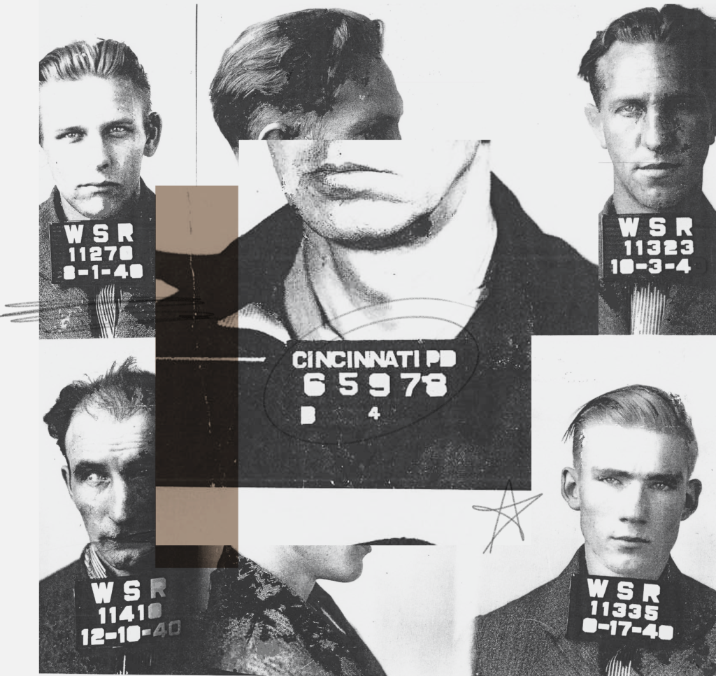
The basis for what would become Bulward started in 2010, when I was three years out of design school. I was a midlevel designer in Nike Brand Design, and my boss-at-the-time, Kevin Wolohan, had given me as a gift a book titled Least Wanted: A Century of American Mugshots, which is exactly what it sounds like (gifting beautiful, esoteric books was a strange quirk of Nike design culture at the time). The context as to why he got me this particular book as been lost to the fog of my feeble memory, but it was a fascinating object and I became very intrigued by the typographic forms which appeared on the placard beneath some of the rough, obstinate faces pictured within.

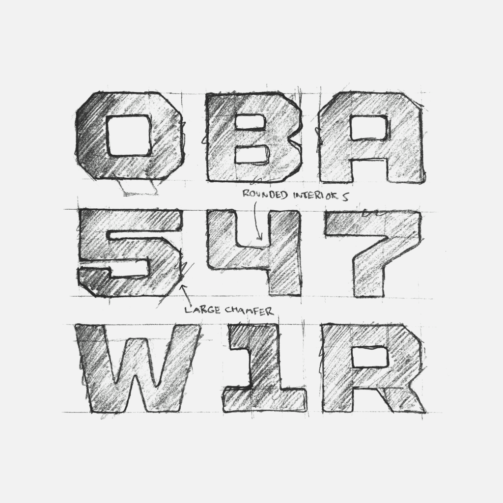
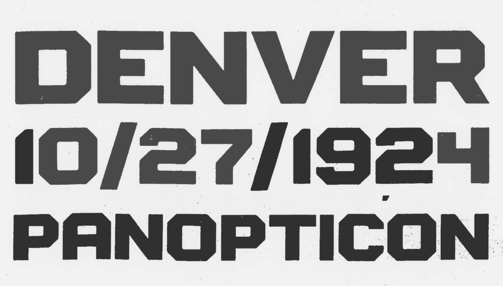
It’s difficulty to tell from the old, grainy images, but these appeared to be wood type, with some form of peg board system to create a swappable modularity. I've never been able to find any physical samples of these placards, but these letters were present in images from jails or police stations in far flung American cities, suggesting it was a product rather than a one-off system devised by a local type cutter or sheriff moonlighting-as-type-designer. Many of the glyphs are missing counter forms, but their design was really consistent — wide, heavy octagonal varsity block with rounded corners (likely the unintentional result of either material limitations or the manufacturing process) and interior forms even more dramatically rounded. I believed these letters were dying to be revived, so I took a swing at digitizing the forms.
At the time the Nike brand was a bit of the Wild West for typography, and as designers we had a lot of leeway when selecting fonts for specific projects or categories, so long as they felt tough and athletic (House Industries’ United and Process’ Stratum were in common rotation in that era due to their favor with Nike’s brand creative director). I thought these forms could fit that brief well and at the time I was in a weird purgatory of doing a lot of Nike's more corporate work and needed a creative outlet. So I sketched out the Latin caps alphabet and numerals, for my own use if nothing else.

I named the first rough ‘cut’ of this font Gratton, the name of a prison long relegated to the dustbin of history which I had stumbled across during research. I wanted something that had some conceptual tie to the mugshots that inspired it, but I also liked how the guttural nature of the word felt born of the same beefy stuff as the letterforms. It was built by bouncing between Adobe Illustrator and Fontographer 4-point-something, the software I had most experience in from doing my type design thesis project a few years previous.
I pitched the very-rough Gratton for use on a few projects, and eventually it landed as the brand typeface for the Nike Better World sustainability project, probably best remembered for its microsite which was a very early and influential use of the parallax scrolling effect. I think its balance of stout masculinity and soft approachability, along with its fairly idiosyncratic construction, made it a natural fit for that initiative and it was great to see it out in the world.
A couple years later, after leaving Nike to try my hand at agency life in New York City, Gratton lived on as a footnote on my portfolio site, downloadable under a Creative Commons license. It was rough, incomplete and not something I felt comfortable charging for, so I let folks do with it what they may with the idea that eventually I would clean it up and make a proper retail typeface out of it. And people did download it, as I would occasionally see it pop up in the wild, which would cause the project to worm its way back into the folds of my brain and I would be re-invigorated to take another swing at finishing it. This probably happened five or six times over the following decade, but with how busy my branding career was, I could just never carve out the time to do it right.

It wasn’t until a full ten years later that a couple events occurred, almost simultaneously; First, my friend Alex Center, who had recently started his own eponymous design firm, wanted to use Gratton in a client pitch and asked for my blessing. Second, an entrepreneur who had been using Gratton under the CC license was interested in having an updated custom version of the font made to unite his endeavors. Neither of those things technically panned out but, combined with having quit my corporate job, it felt like the universe was telling me to finally dive in and update this thing.

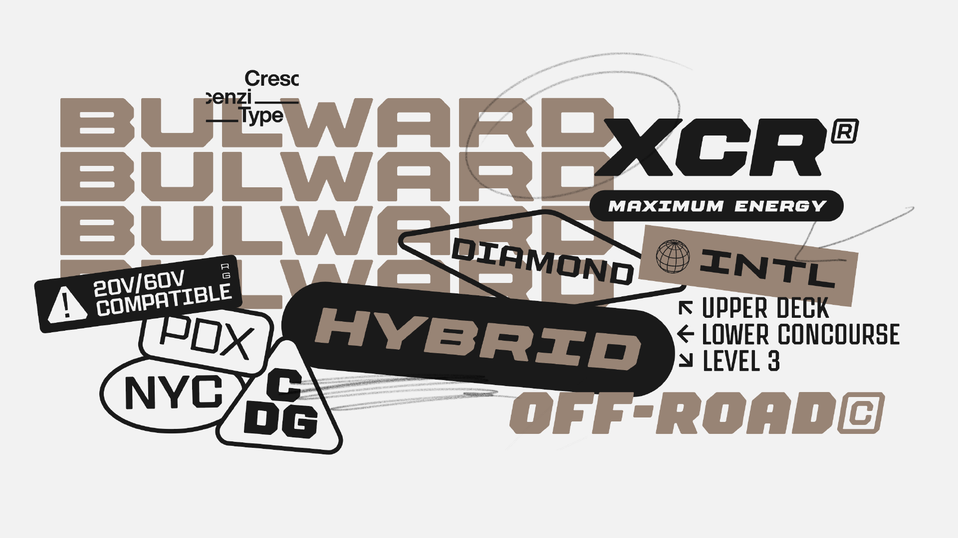
With a decade-plus of experience under my belt and a far more trained eye, it was obvious the original design was full of youthful indiscretions borderlining on egregious errors. So, as one does, I re-designed it from the ground up — I couldn't even get the original Gratton Fontographer file from 2010 to open — with a lot of updates to the underlying typographic structures including proportions of stem to bowl, elimination of what I determined was un-necessary optical overshoot, and adjusted radii of the corners and counters. The process of re-imagining this font was like collaborating with a past version of myself. Once I dove in it wouldn't let me go, so what was supposed to be a simple update to a single display font evolved into a broad family with 30 styles in roman and oblique, stylistic alternates and a variable font that allows for literally millions of possible permutations.
With a ground-up rebuild, not to mention the myriad of new inspiration I have collected over the decade-plus since Gratton’s original design, I didn’t think being the ‘mugshot font’ felt appropriate any longer. So after a lengthy process (naming fonts is hard as hell!) I coined a new name: Bulward. Sort of a portmanteau of bulwark and stalwart. Similarly to the original name, to me the word feels like the font: bold and tough, tempered slightly with the approachable and optimistic.
So out of the dozens of half-finished typefaces in my sketchbook or languishing on my hard drive, it’s fitting that Bulward is to be the very first release from my new endeavor Crescenzi Type, literally over a decade in the making. I can’t wait to see what who all will do with it, but perhaps even more so I am excited to see what will fill the space in my brain freed by finally relinquishing control of these letterforms. You can test out or buy Bulward here!
