A massive congratulations to LeBron James for being the first player to eclipse 40,000 career points (not to mention breaking the NBA’s all-time scoring record). What an unimaginable career, and with seemingly much yet to come. Being the designer of LeBron’s logo is very likely the project I will forever be most associated with, no matter what I’ve done since or may yet do in the future. It’s hard to comprehend that little crown has been around for 13 years now, nor can I overstate its impact on my career.
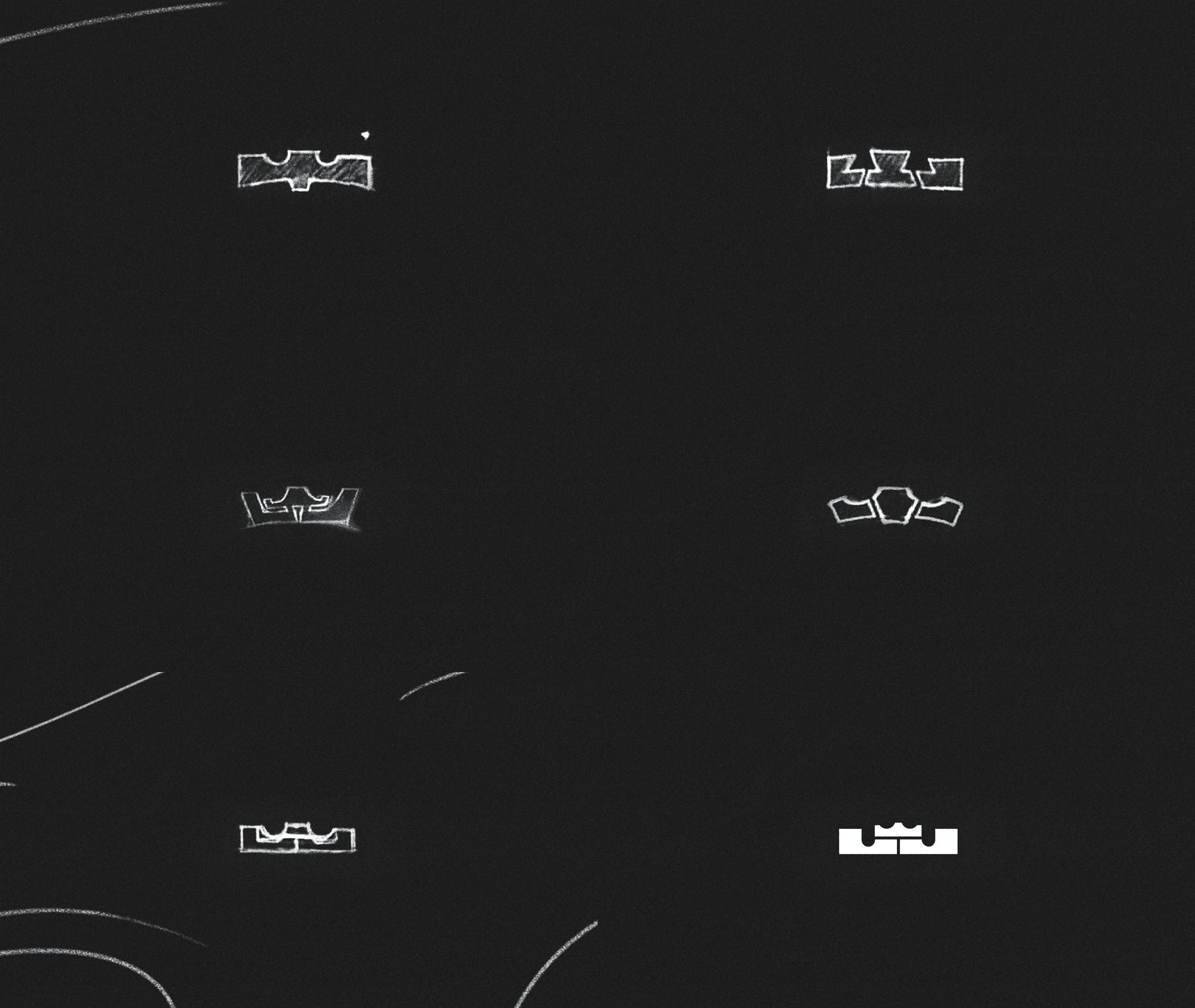
His continued shattering of records has me feeling nostalgic; I recently dusted off my sketchbook containing the logo original LeBron logo sketches, and it brought lots of memories rushing back. It is, frankly, insane this project was trusted to a midlevel designer three years out of school, and I am forever indebted to David Creech (at that time Nike Basketball creative director, now co-founder of the wonderful agency Adopt) for inviting me to take a swing at it.
Some in the company had wanted to update LeBron’s logo for years — it was a very cool graphic featuring a crown, his initials LBJ and his jersey number 23. A pretty remarkable feat, but the logo was difficult to properly execute on physical product due to its visual complexity. Before I was even involved (possibly before I had even graduated university) several top-notch agencies and independent designers whose work you probably know had been hired to ideate, not to mention some swings from several insanely-talented designers on the Nike brand team. I’ve seen all that work, and was awe of its excellence and thoroughness — I can verify no stone was left unturned in exploring the possibilities. But what ultimately was missing was a true moment of need that forced a change.
Then came LeBron’s move to Miami, and with it a jersey number change from 23 to 6 which rendered the existing logo obsolete and turning a project that had been simmering for years into a two-week sprint.
The brief I received was very tight: create an iconic “King James” crown, simple enough to reproduce beautifully on footwear and apparel product and future-proofed to avoid anything which could change down the line (I still cringe a bit whenever I see an athlete with their jersey number in their personal branding).
He was clear about liking the shape of the crown embedded in his old logo but it needed that extra something to become an ownable global trademark, which is where my process began. After dozens of pages of pencil sketches and a couple quick rounds of rough vector to block out the proportions, I had our final proposal: an LJ monogram, counterforms based on the shape of the keys of a basketball court, topped with the existing crown. A remarkably quick process, all things considered.
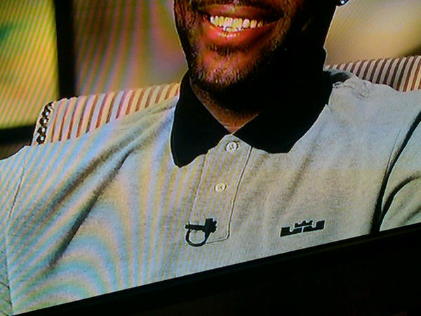
I remember David calling me from Akron after finishing his presentation to LeBron, saying it had been approved. It was almost nonchalant, and the hugeness of the moment didn’t really sink in right away. Product lead times are long, and often at Nike you’re already onto the next thing or the thing after that by the time your work actually reaches market. The lack of immediate market feedback tends to keep hype in check. But then, not long after giving his approval, LeBron went on television wearing a polo with the new symbol embroidered on the chest.

It was a prototype garment we had made up as part of the logo presentation, and his stunt was completely unplanned. LeBron leaked it himself, something which showed us that he really loved where it landed. It was far cooler (and way more buzzy) than any kind of intentionally executed PR launch likely would have been. Seeing it on TV, this secret at the time only a handful of us at Nike WHQ knew, was perhaps the most exciting thing I’ve experienced in my career.
For me, the most rewarding thing about designing brand symbols is what happens AFTER the work launches and my involvement ends. In its 13 years the LeBron logo has lived so many lives and some of the most talented designers in the world have (and continue to) use it as a vessel for levels of creativity which consistently inspire awe. It’s been carved into crystal, made into sculpture, inspired a font, been tattooed on the bodies of countless fans, even toofed (not to mention the amazing work of Jason Petrie and the Nike Basketball team on LeBron’s signature product).
My experience watching this logo appear in every type of environment and material imaginable, and still remain recognizable and iconic, only hardened my young-designer bias towards the allure of simple symbols. Simplify to amplify, so the Nike Maxim goes.

Everybody wants something with the power of the Swoosh or the Apple, but few have the discipline or foresight to buck tradition and really see it through. I’ve had several conversations in the intervening years with sports teams and related brands where my belief in the power of stripping back form and eliminating extraneous detail in order to unlock long-term creativity has likely lost me the gig — simplicity can be hard to communicate and often cuts against the entrenched business mindset of more-more-more, but that’s a whole different topic for another time.
Lots of things can happen to a logo after you put it out into the world — companies fail, or pivot, or fade into irrelevance. Brands get merged, new leadership wants to demonstrate change, businesses are beset by scandal. I’ve had good logos die every way a logo CAN die (and boy, do I have some stories). But my goal as a designer is always to set out to make something that could live forever, that is capable of weathering the storms of trendiness and business change and hum-drum restlessness of capitalism, because hey, that’s what I’m good at and all I can really control.
Seeing how the LeBron branding has evolved alongside the man over the years is a constant source of personal joy. The thing that makes me most proud of the LeBron James logo is that the man himself is such a phenomenal leader, role model, and ambassador for the sport far beyond his continued brilliance on the court — to paraphrase Michael Beirut, a logo is a vessel, and LeBron keeps filling his with positive meaning. I’m really happy for his success, and for my (admittedly distant) proximity to that greatness.
Young me felt lucky to simply be at Nike, let alone doing work with this kind of reach. Being a part of this project has opened so many doors, and also clarified to my restless younger self what I wanted the focus of my career to be: Creating these kinds of lasting symbols. For that realization I am very grateful.
