
I’m very excited to announce the launch of Crescenzi Type, our independent retail font foundry. The purpose of Crescenzi Type is simple: Create memorable, emotive and useful typefaces designed with brand-building and content creation at top of mind.
My approach has always started with a desire to create well-crafted design artifacts that last and provide great utility to clients. And the more my work moves beyond symbol and logotype design and into the creation of bespoke typefaces — such as my recent design of UFC Sans or my work leading the creation of AT&T Aleck for Interbrand — the urge to apply this thinking to retail typefaces has grown too loud to ignore.
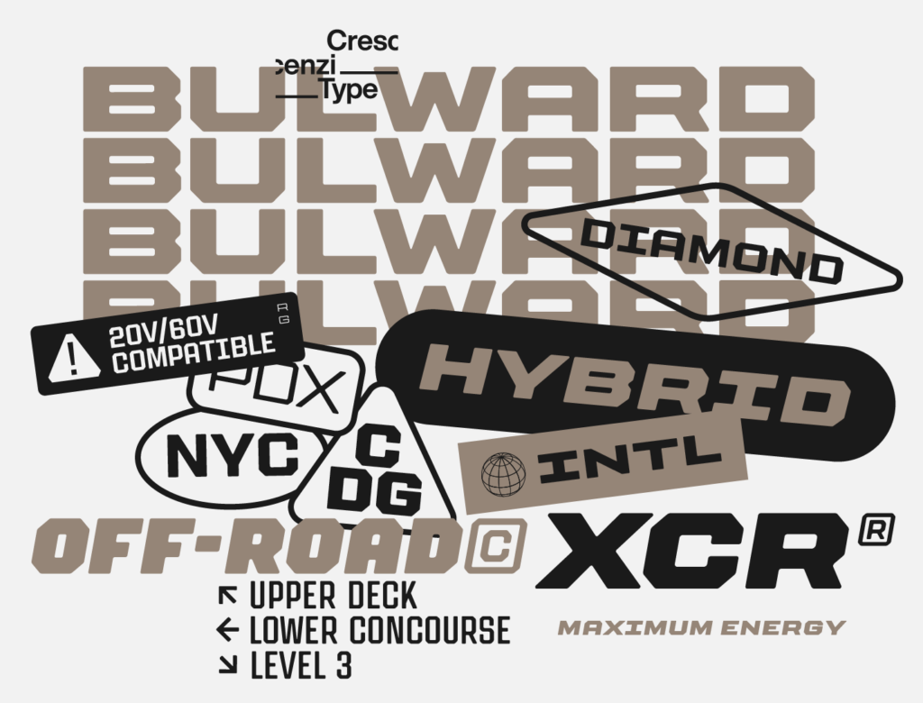
And so now here we are: Crescenzi Type is launching with Bulward, a font family I have been working on in some capacity for over a decade, with a coarse charm I believe fills a unique space within the varsity block archetype. Two additional fonts are in various stages of completion and will be along by the end of the 2024, and I have a sketchbook full of ideas I can’t wait to get to after that, but I think it’s fitting that my first retail typeface fits into a sporty niche.
I consider Crescenzi Type to be “in beta,” and a method for experimenting with the business model of type, as well as an excuse for me to hone some skills in managing e-commerce and marketing. I tend to think traditional font licensing is far too complicated, and so I am launching Crescenzi Type with a couple of these experiments right out of the gate, the first being what I’ve seen elsewhere described as inclusive licensing — the merger of what previously would have been separate licenses for desktop, web, app, ebook or broadcast usage into a single all-encompassing agreement.
Additionally, I know building equity in a design system equity requires consistent type usage across all of a company’s experiences. I want to make that easy without overcomplicating the process. I also think it’s extremely burdensome on customers to track monthly page-views, especially since those numbers (and therefore costs) can fluctuate greatly. I also believe new and emergent platforms, and subsequently new places to use fonts, are going to continue to proliferate and the idea of even more types of licenses and even more complexity feels like the exact wrong approach. One license for everything just makes more sense, even if it seems it will generate less revenue in the short term.
The second experiment at launch is whole-company licensing. Taking inspiration from the model used by the type foundry Lettermattic and some other independent type designers, the idea is to treat customers as holistic entities based on number of total employees, rather than selling type by the number of installs (which is essentially impossible to verify anyway).
It’s onerous for a company to have to track the number of font installations or active users, especially in larger organizations, leading to customer anxiety. I’ve also had branding clients adverse to buying new fonts altogether stemming from past issues with complicated licensing. This is no good for anyone!
In addition, I am a beliver in the power of typography to tie organizations together and create value for a business. I’ve worked with influential, multi-billion dollar companies that have only a few designers on staff and so would only require that many licenses under the traditional model, a dramatic asymmetry from the impact the fonts provide. Licensing based on company size is an attempt to connect the value of the fonts with the value they create — it’s certainly not perfect, but to me makes more sense than per-seat licensing ever has. Licensing a whole organization at once hopefully makes staying within the license bounds worry-free for a customer, who can freely distribute the files within their organization, and it is also much easier for me to verify the correct license has been purchased. I’m proud to be one of the independent type studios trying to figure out a better way, and appreciate the foundries who have inspired me to try this model out. It’s an experiment, and if you have issues with this approach I welcome hearing your feedback: darrin@crescenzi.co. We’ll see how it goes!
The downside of both inclusive licensing and whole-company pricing, of course, is a higher base price point since a customer can’t exactly whittle down the license options to only cover the barest needs, and barriers-to-entry are typically bad for business. However, I believe the simplicity of these approaches combined is in itself compelling and makes pitching fonts to clients far easier. In the spirit of being “in beta,” Crescenzi Type will continuously re-evaluate and refine the approach as feedback and data comes in.
This has been a passion project some time in the making, and I’m so excited to finally launch Crescenzi Type and see what happens! Please check out our first release Bulward, and stay tuned for much more.