
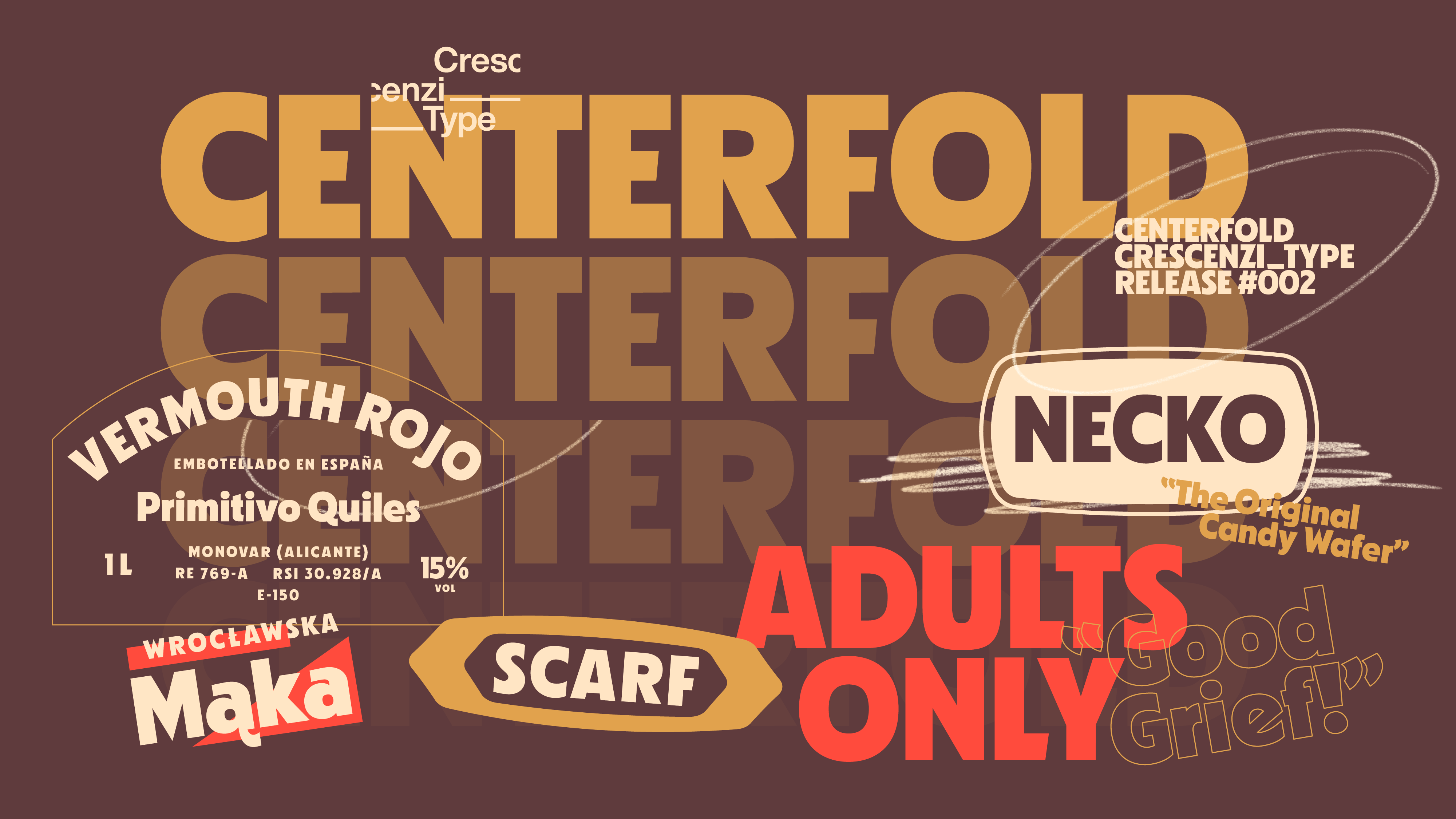
I’m super thrilled to announce the second release from Crescenzi Type, Centerfold! It is a fun, vibrant sans serif display font inspired by film posters, adult magazine mastheads and various classic print advertisements of the 1970s. With pointed terminals juxtaposed with sultry curves and slightly squat bowls, it is inspired by a gamut of ’70s headline type, buffing some of those designs’ idiosyncrasies while adding new quirks and modern details making it fresh for today’s uses.
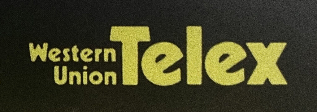
As is common with my type design work, the idea that would eventually become Centerfold began as a brand identity concept for Western Union, a project I was working on with my friends at Love Street and Co. I was inspired by on an old Western Union yellow pages advertisement that was typeset in Rudolph Koch’s Kabel Black, but a little chunkier and softer due to the bleed of ink on the cheap, pourous paper. There was something approachable and warm about the way the letters looked, and I quickly threw together a rough logotype and a few key letters based on reviving that look from the brand’s history.

Though the concept didn’t make it a whole lot further than that (a good thing — I couldn’t be more proud of where we landed) and I shelved the idea for over a year, the notion of a typeface based on expressive, quirky, heavy typographic forms from the ’70s kept growing in my head and I began some napkin sketches and early formal studies in the background during breaks from client work.
After a while it began to wiggle its way into the foreground of my mind, and by spring 2024 I had a fairly clear vision for the font and fully committed to the process — collecting reference materials and tactile ’70s ephemera to help figure out exactly what it needed to be. I rewatched a couple latter seasons of Mad Men and the entirety of Minx (please bring it back!) to get in the mood, television with great attention to typography and period detail.
I knew I wanted it to feel a little sleazy, a little wrong: like a smoky cabaret or brown shag carpet or magazine that comes in an opaque envelope. I also knew that I didn’t want to make a straight up revival of Kabel Black — both because some really killer modernizations already exist and because ultimately the point of Crescenzi Type (and my interests in general) is to create differentiated typefaces which can do heavy lifting in branding contexts.
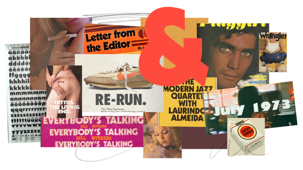
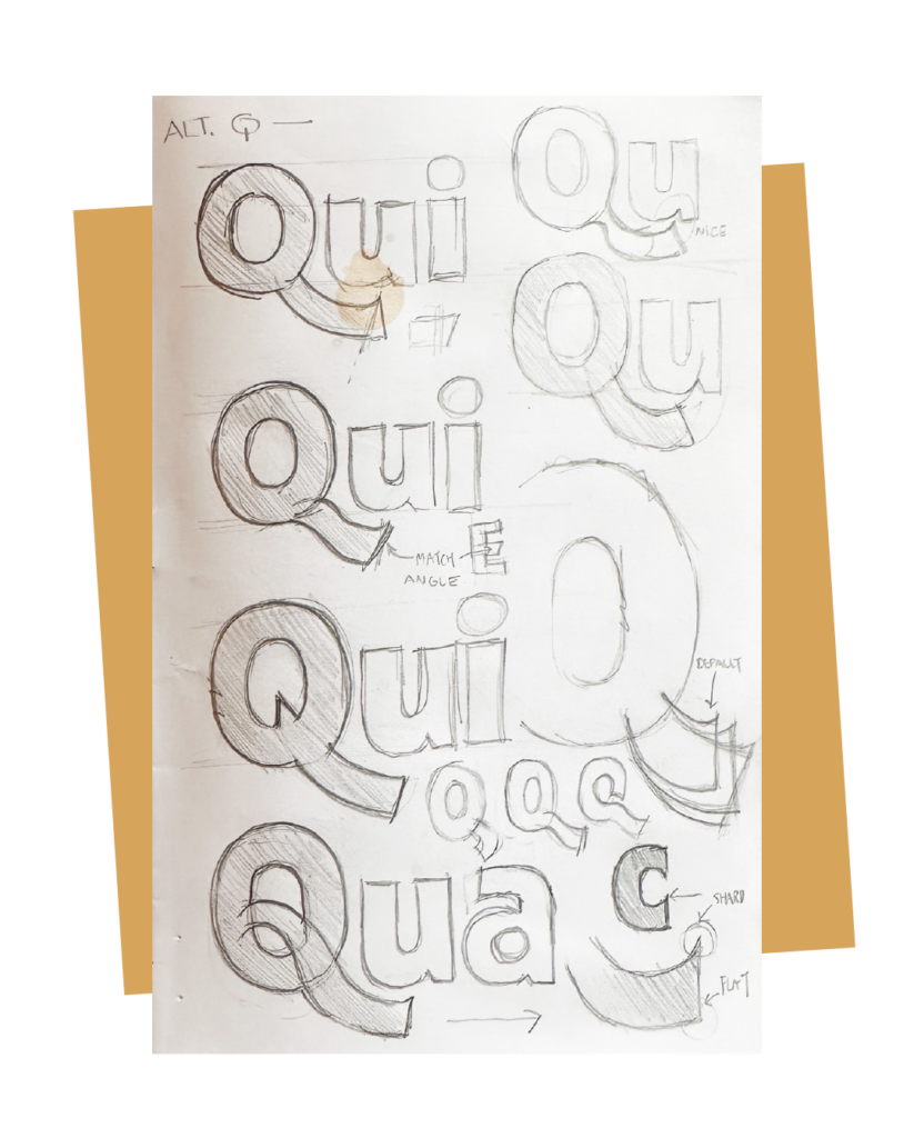
So while the color of the font feels “Kabel-y” and, like that typeface, works powerfully in both sentence case and all-caps settings, Centerfold really came into its own when I began pulling in references from other classic typefaces; Futura Extra Bold Condensed, Avenir, various lettering work from Othmar Motter and Herb Lublin. Its slightly asymmetric terminals, a bit flatter on the outside and pointed on the inside, came from a hand-lettered cigarette ad — it really is a pastiche of lots of period sources. One thing I knew I wanted, even going back to the original Western Union sketches that began this whole journey, was to ditch the tilted lowercase e for something more normative: While feeling definitively 1970s, that specific letterform seemed to me very limiting for contemporary use (though I ended up caving at the last minute and putting it back in as an optional stylistic alternate, along with a few others).
For most of the font’s development I had given it a silly working title (which I won’t share here because I may yet use it for another upcoming project), but the name Centerfold was inspired by a stack of ’70s Playboys I picked up at an Upstate vintage store for, you know, type research.
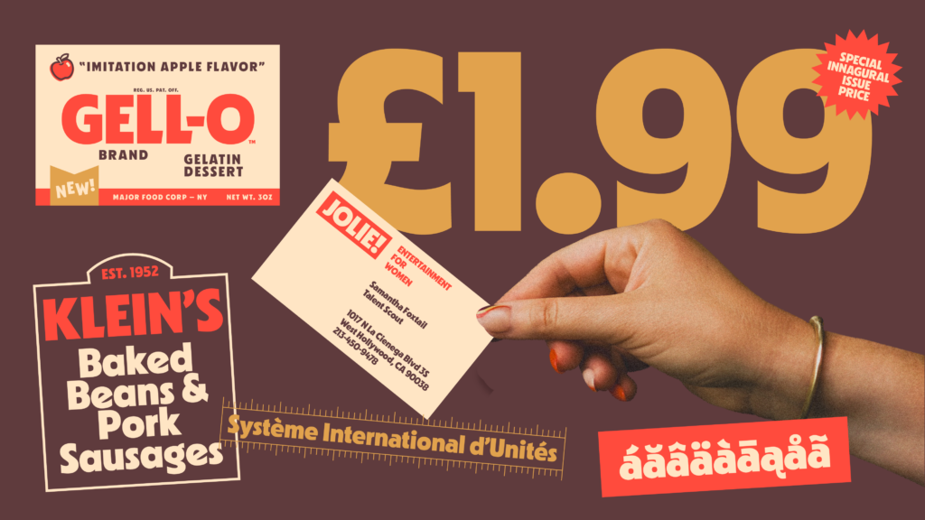
The specimen for Centerfold was incredibly fun to make — lots of references to seventies consumer packaging, brands, catalogs and magazines. The Tumblr blog Seventies Dinner Party was a huge inspiration, as well as the brilliant folks at Dark Igloo who created an amazing book re-cropping images from Playboy editorials to focus only on the models’ hands, a funny and brilliant re-contextualization (which I then shamelessly borrowed — a big thanks to my wife Erin Mintun for helping me with the color palette, being my hand model, and getting her fingernails painted on theme).
When doing design work that is meant to connote an era, whether branding or illustration or type design, my goal is always to create something that feels viscerally evocative. Like you know it’s always been there even though you haven’t actually seen it before: the Mandela Effect but make it fonts. Many years ago I was doing some writing for a now-defunct AIGA blog titled Design Envy, which featured designers’ musings on inspiring new work by others. I wrote a small piece about Tobias Frere-Jones and Jonathan Hoeffler’s magnificent typeface Idlewild, how it felt of “a Tomorrowland modernist dream that never came to be,“ something that is new but just feels soright it’s actually somewhat jarring to learn it didn’t already exist.
I hope Centerfold is something approaching this ideal, a font that feels inevitable, born of pulp and the sleaze, smelling like Lucky Strikes and damp with sloshed dirty martini.