Reebok
Helping a beloved sportwear brand
ressurect a classic icon
Reebok
Helping a beloved sportwear brand resserect a classic icon
Founded in 1958, Reebok is one of the most iconic names in the sportswear industry. After several ownership changes and shifts in business strategy, the former footwear giant was suffering from a fractured identity, struggling to balance nostalgia for its golden era with a new vision for the brand.
Presented the opportunity to unite Reebok under one banner, we combed through Reebok’s vast archives to understand which of their many logos had the most equity and potential to unify the (previously separately-branded) performance and lifestyle divisions, and modernize that asset to meet the needs of today’s communications and the latest methods-of-make.
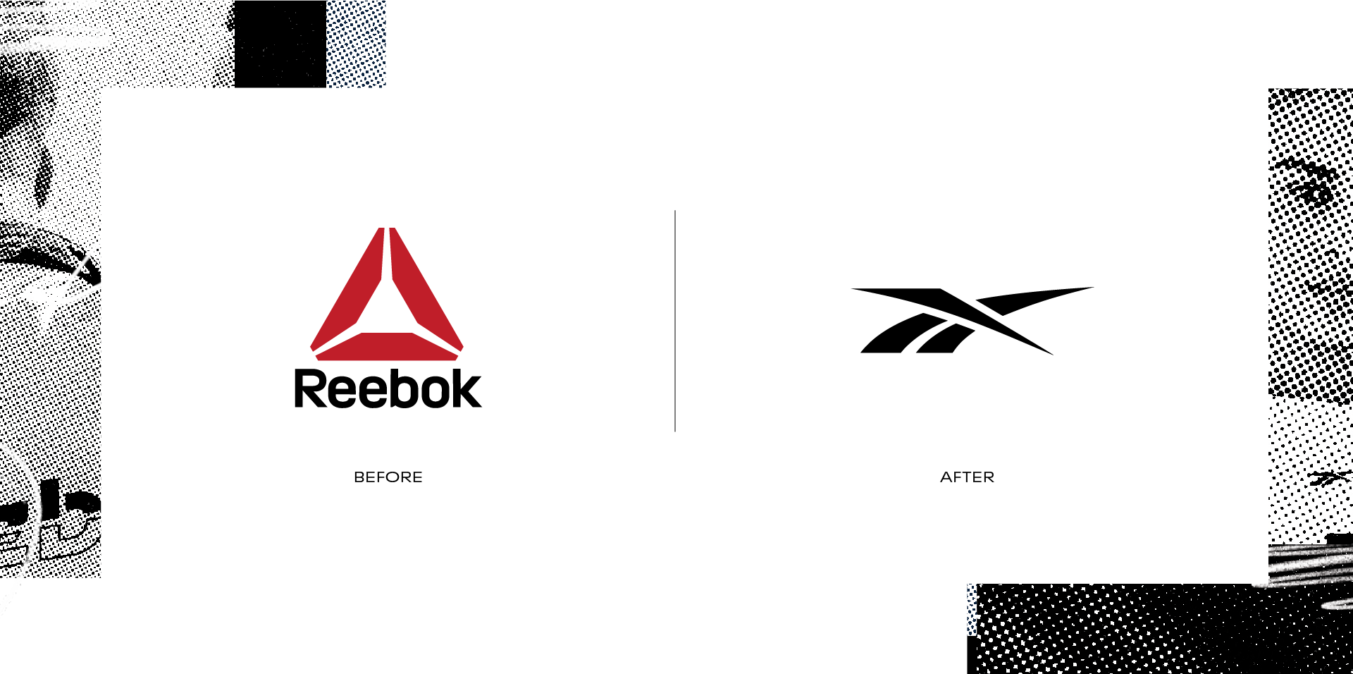
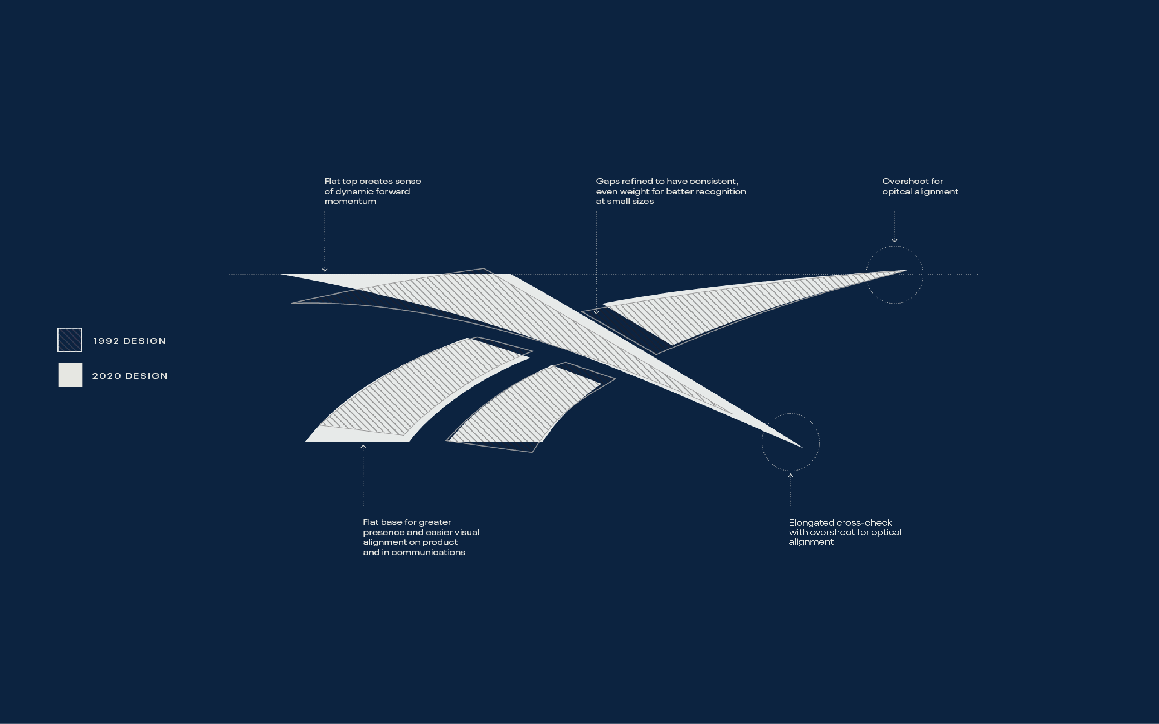
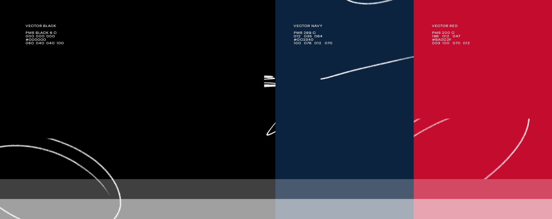
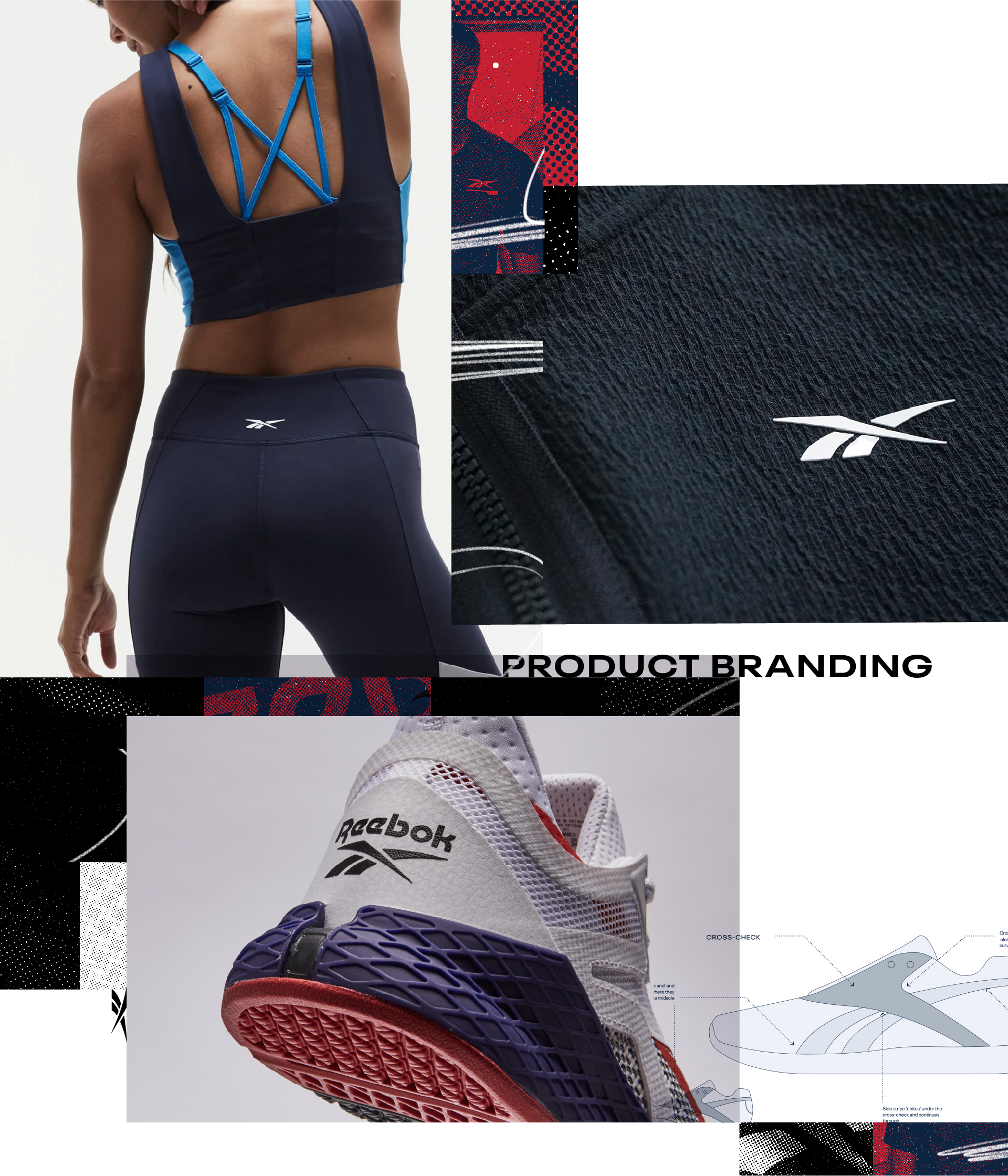
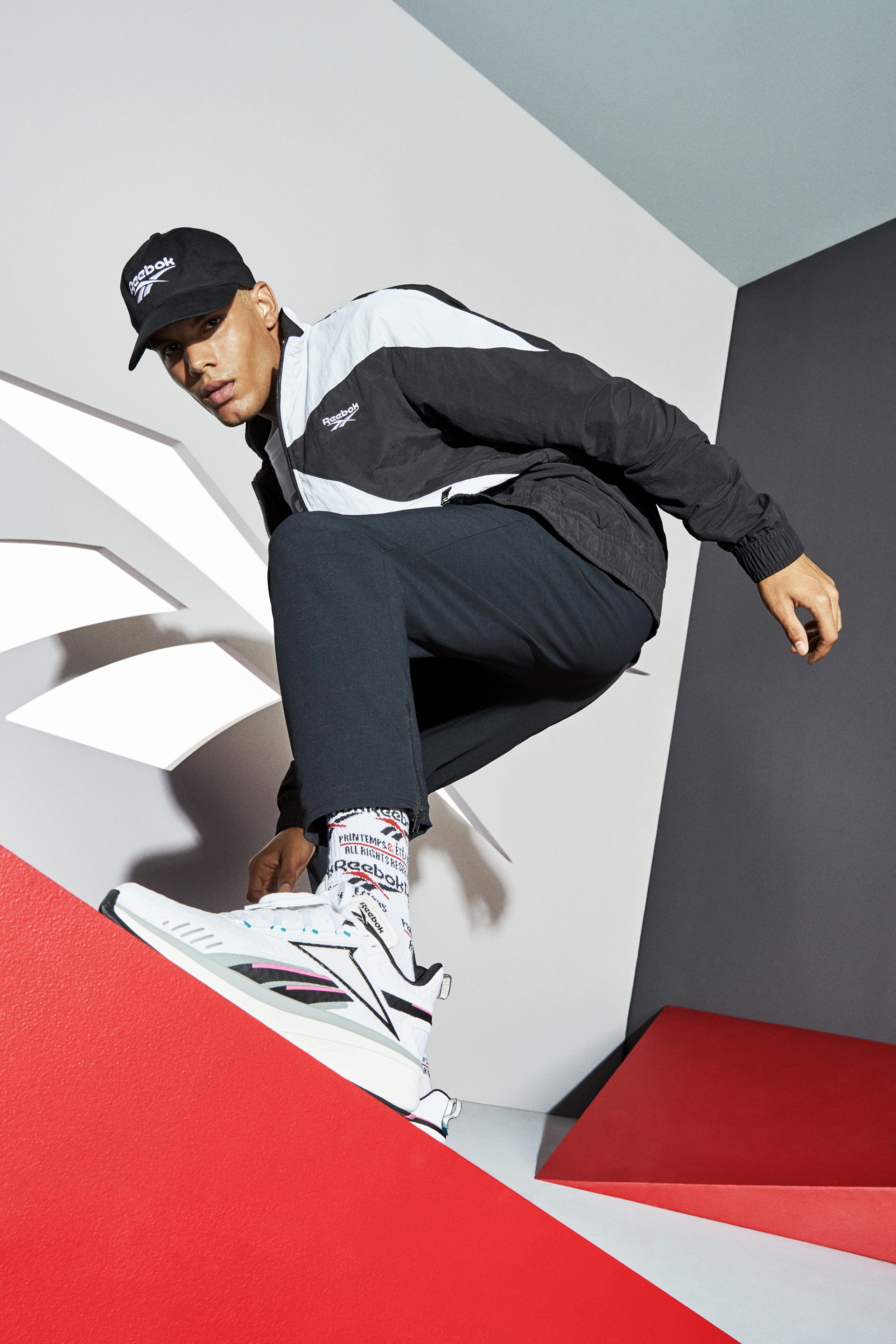
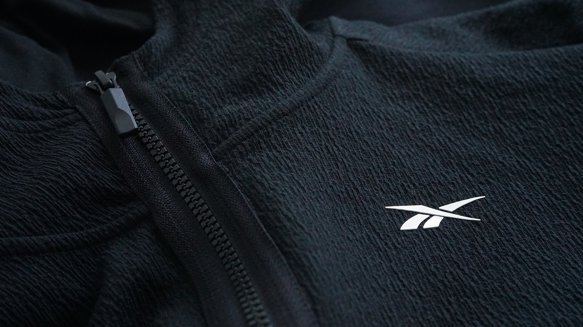
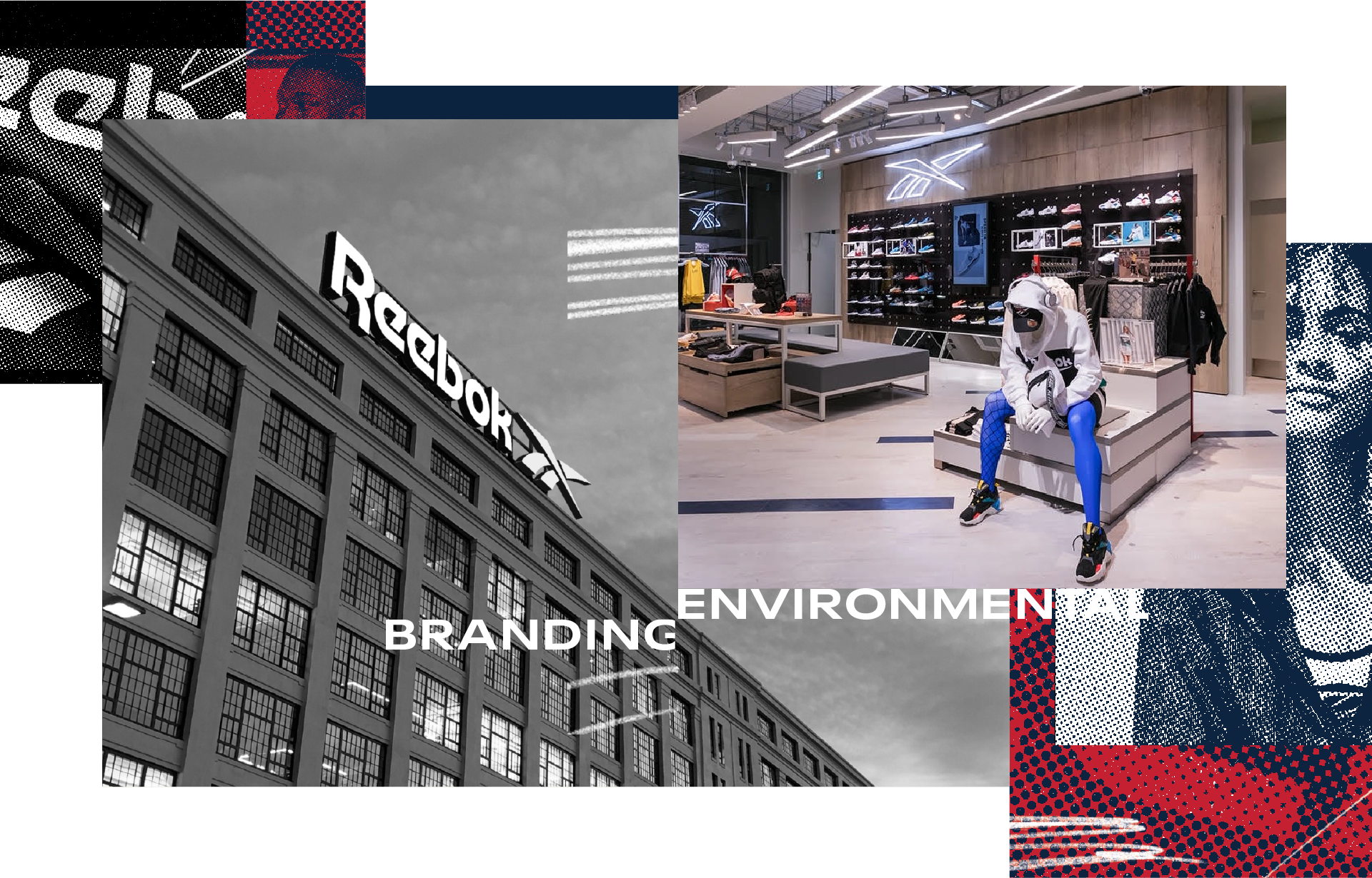
Resurrecting the Reebok Vector logo satisfies every goal we set out to achieve — it’s beloved, dynamic, and looks amazing on footwear and apparel. To bring the logo forward into 2020, Vector symbol and Reebok wordmark were re-drawn to improve their reproducibility on product and legibility at smaller sizes, by increasing spacing and refining curves all around. Working closely with their in-house team, we created a new visual language and identity guidelines for communications and product, and helped the organization execute the new vision across new product, retail, digital and packaging.
Resurrecting the Reebok Vector logo satisfies every goal we set out to achieve — it’s beloved, dynamic, and looks amazing on footwear and apparel. To bring the logo forward into 2020, Vector symbol and Reebok wordmark were re-drawn to improve their reproducibility on product and legibility at smaller sizes, by increasing spacing and refining curves all around. Working closely with their in-house team, we created a new visual language and identity guidelines for communications and product, and helped the organization execute the new vision across new product, retail, digital and packaging.
© 2026
© 2026
© 2026
© 2026
© 2026