Richardson
A new symbol for
growth from a merger
of international sales
training leaders
Richardson
A new symbol
for growth from
a merger of international sales training leaders
Richardson
A new symbol
for growth from
a merger of international sales training leaders
Richardson
A new symbol
for growth from
a merger of international sales
training leaders
Richardson
A new symbol for growth from a merger of international sales training leaders
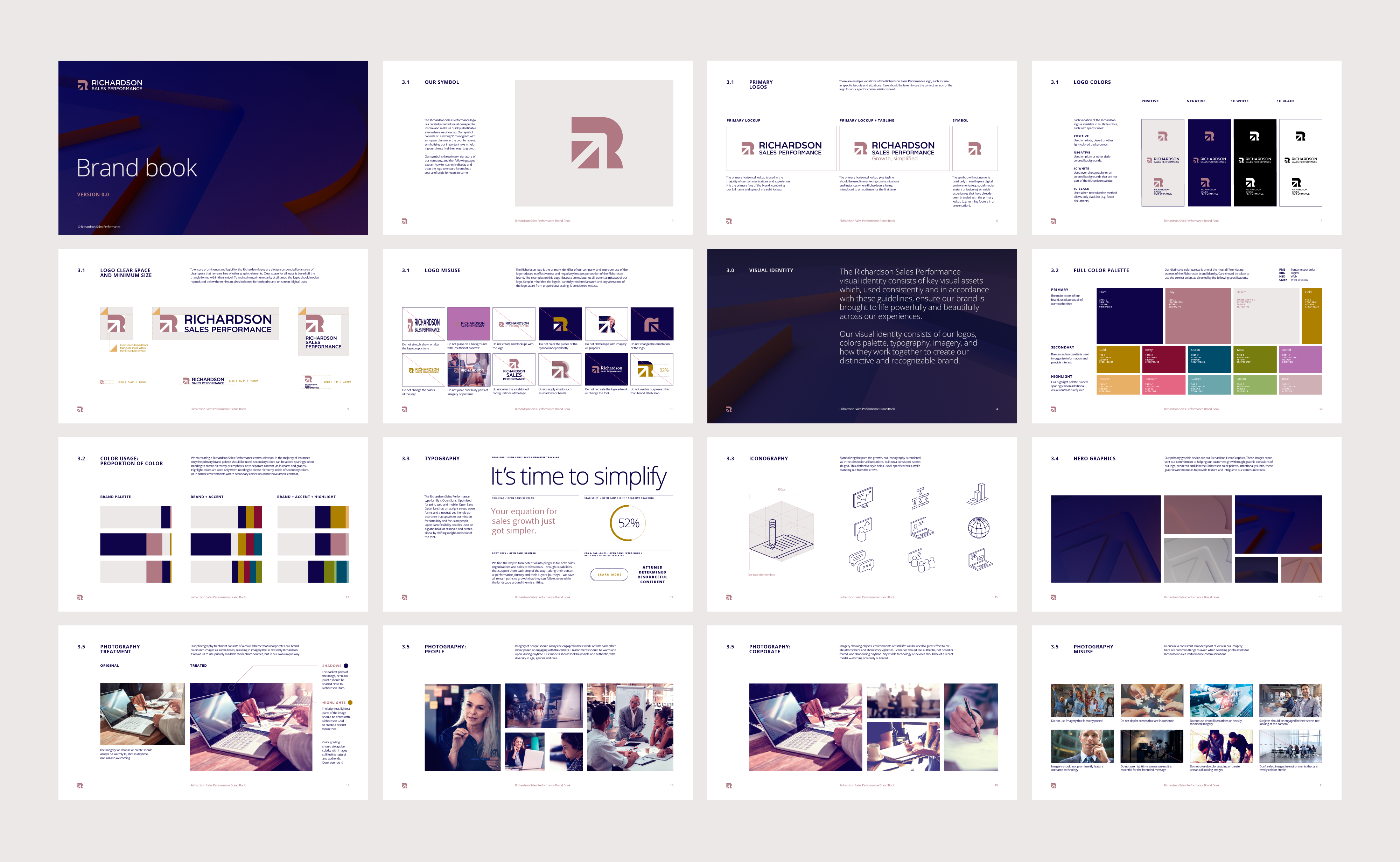
Richardson and Sales Performance International, global industry leaders in sales training, were merging and needed a new identity to unite the two organizations’ products, processes and cultures. Building from a new brand strategy authored by our friends at Doublebit Narrative, Crescenzi Co developed a comprehensive visual identity system built on the core idea “Growth, simplified.”
Richardson and Sales Performance International, global industry leaders in sales training, were merging and needed a new identity to unite the two organizations’ products, processes and cultures. Building from a new brand strategy authored by our friends at Doublebit Narrative, Crescenzi and Co developed a comprehensive visual identity system built on the core idea “Growth, simplified.”
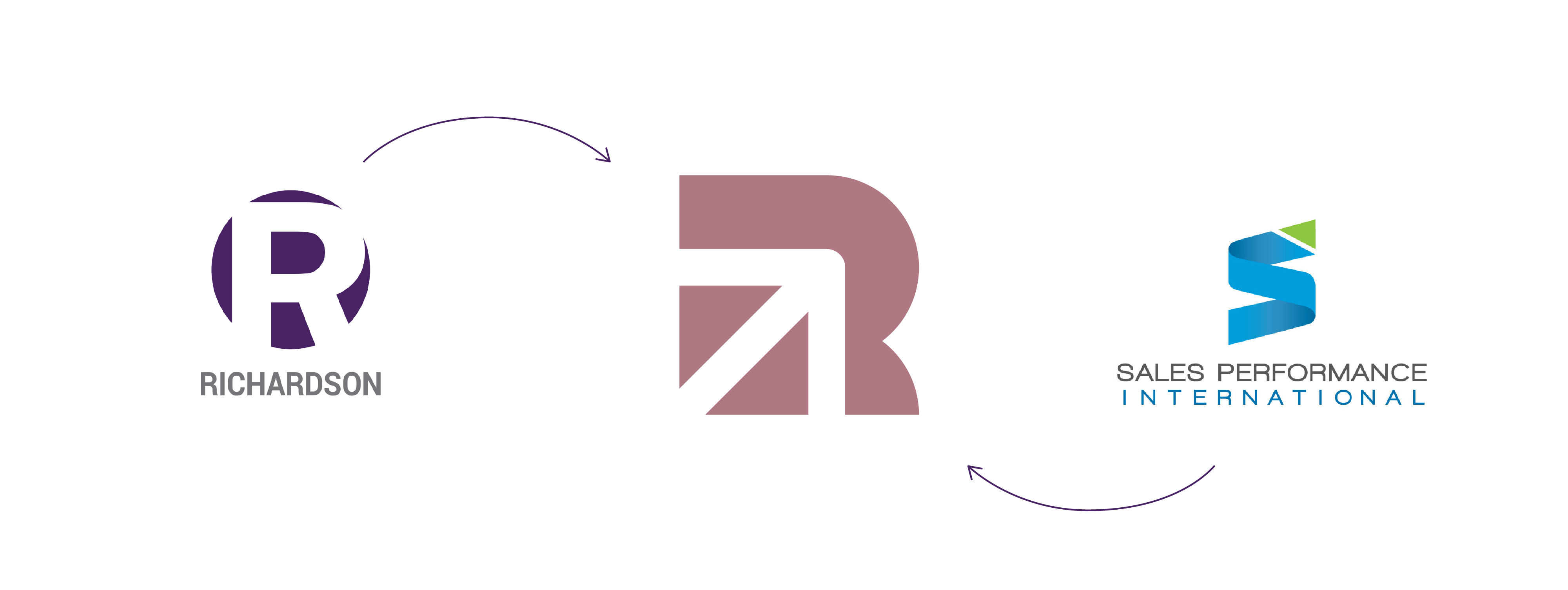
As a merger of equals from different regions, the new Richardson Sales Performance brand symbol borrowed equities from both legacy brands—the R monogram of Richardson and the Northeast-pointing arrow from SPI—combined into an iconic symbol of growth.
As a merger of equals from different regions, the new Richardson Sales Performance brand symbol borrowed equities from both legacy brands—the R monogram of Richardson and the Northeast-pointing arrow from SPI—combined into an iconic symbol of growth.
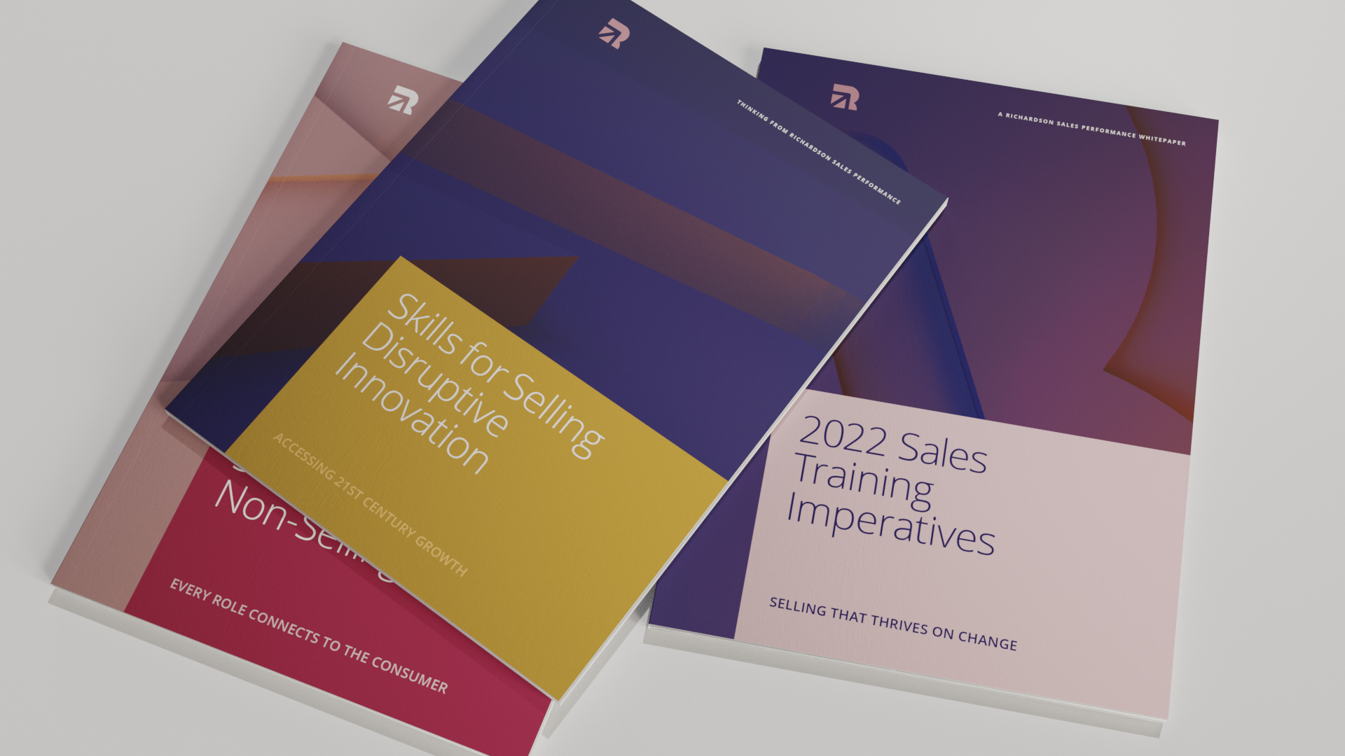
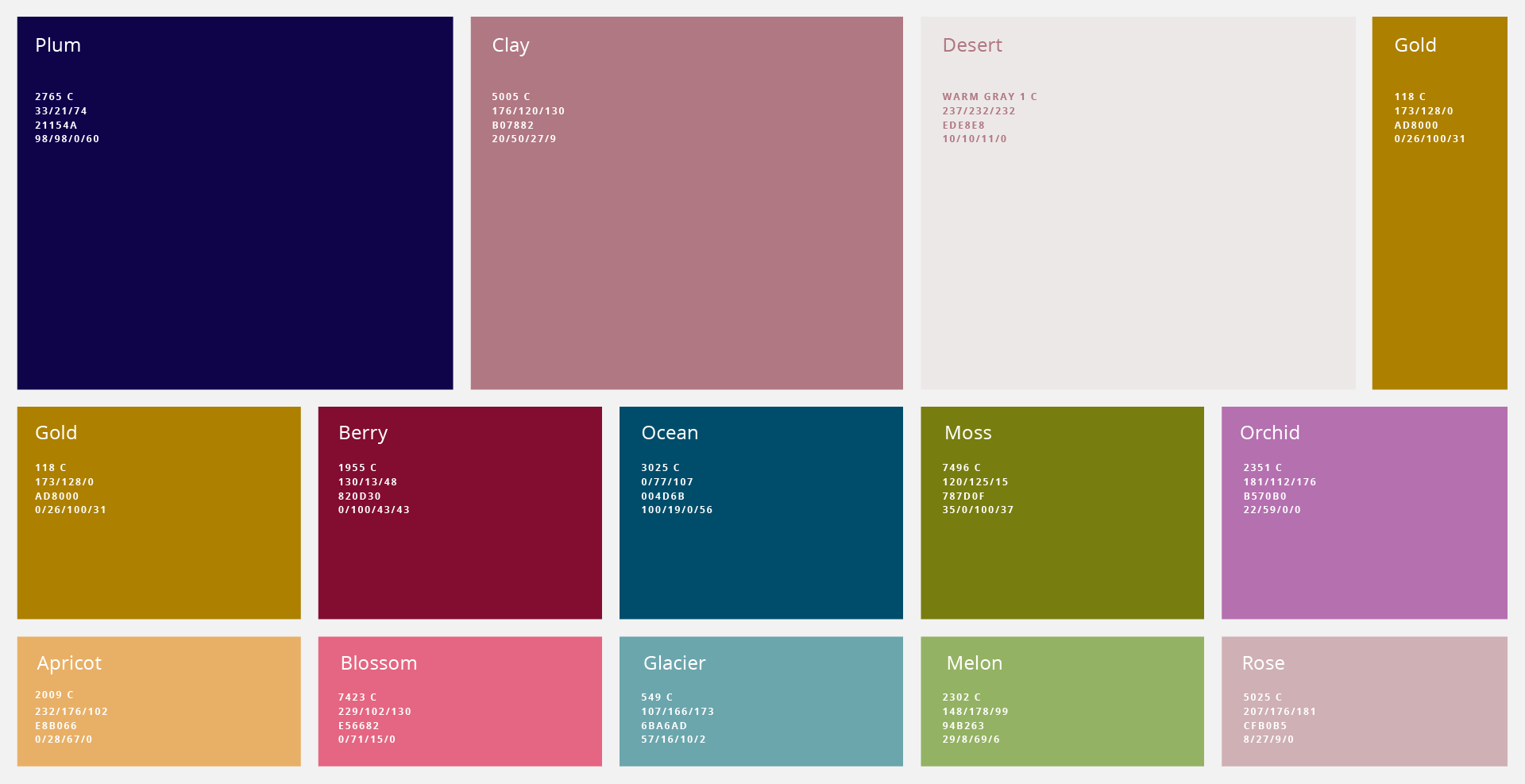
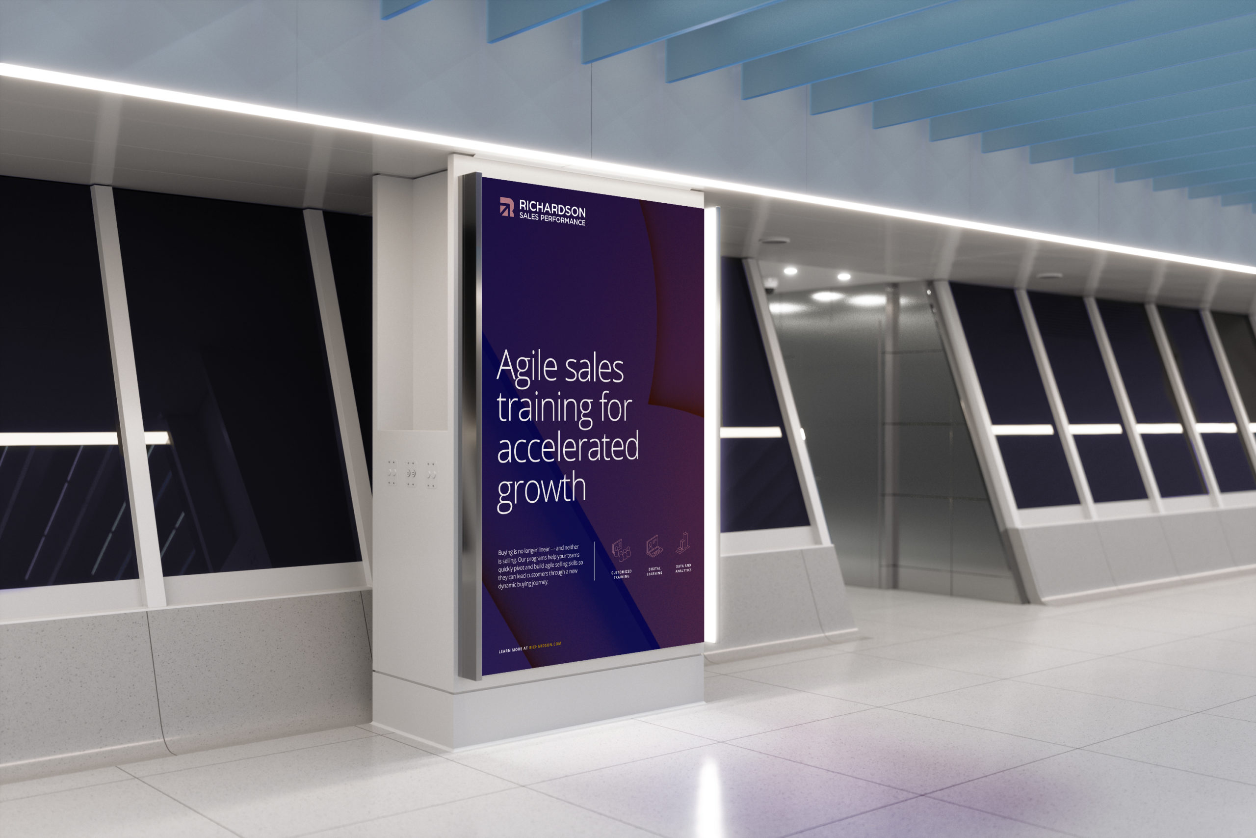
“Growth, simplified” is further expressed through three-dimensionality throughout the design system. A vertasile series of hero images showcase the Richardson symbol rising from the surface and reaching upward. A bespoke icon set similarly uses dimensionality as a theme, and a color palette derived from the natural world serves as an additional visual metaphor.
“Growth, simplified” is further expressed through three-dimensionality throughout the design system. A vertasile series of hero images showcase the Richardson symbol rising from the surface and reaching upward. A bespoke icon set similarly uses dimensionality as a theme, and a color palette derived from the natural world serves as an additional visual metaphor.


© 2026
© 2026
© 2026
© 2026
© 2026